Los columnistas de Visualmente::Carlos Gámez Kindelán::Rodrigo Sánchez::Jordi Catalá::Mario Tascón::Samuel Granados::Dolores Pujol::Fabio Marra::Luiz Adolfo::Leo Tavejnhansky::Massimo Gentile::Pablo Corral::Angel Casaña::Pedro Pérez Cuadrado::Tomás Ondarra::Kohji Shiiki::Elio Leturia::Rodrigo Fino::Ramiro Alonso::Sergio Fernández::Lo más leído de Visualmente::Portadas::Infofreak::Fotografía::Especial Helvética::Especial: Frases del 2008::Especial Cooper Black::Creatividad::Caricaturas::Cuartas Jornadas::Cumbre Mundial::Desnudos::Diarios impresos::Diarios online::Diálogos Visuales
Nuestros Blogs Asociados::Visualmente::Indio::Infograkids::Infografreaks::Infografreaks-edu::Mala Magazine::Bar Visual::Tipográficamente::Chillart::Universitariamente::Visualmente-Edu::Vía Libre::Bar Uch::Que Bien Que La Estamos Pasando::Twittermente::Seguinos en Twitter::Las editoras de Mala::Cristina Poetto::Miru Trigo::Ivonne Caamaño::Ana Ottone::Evita Las Tentaciones::Gaba Urco::Nacha La Macha::Beta Ramírez Bustelo::Carolina Ramírez::Connie Moreno::Juana Medina::Yanina Isabella Tejera::Anna Marti::Lina Delgado Cortés::Sofi Ginestra::India Herrera::La Bender Baruch::Los editores de Chillart::Martín Pons::Pinguboy::Raúl Manrupe::Elio Leturia::Les Cuevas Otonelli::Nathalie Sonne::Germán Kemerer::Lucas Groglio::Rodolfo Fernández Alvarez::Raúl Della Valle::Julio Cuervo::Javier Cuello::Julián Chappa::Fabián Carreras::Jenny Canales Peña::Gastón Caba::Pablo Bobadilla::Federico Fuertes Guzmán::Bender Baruch::Seguinos en Twittermente

14.8.12

Exclusivo: Esta es la Typogami

Captura de pantalla 2012-08-14 a la(s) 09.17.43
Captura de pantalla 2012-08-14 a la(s) 09.22.41
Captura de pantalla 2012-08-14 a la(s) 09.45.06
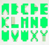
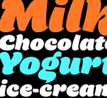
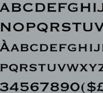
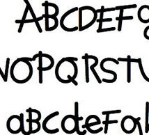
Te lo habíamos prometido y hoy cumplimos. En las redes explotó una tipografía basada en el viejo arte japonés de doblar papeles. Se llama Typogami y es una font animada que creó el diseñador o holandés Jeroen Krielaars, del estudio Calango. Está realizada en After Effects. A continuación, una breve charla con su creador, exclusivo para Visualmente.

1. How did you decide to make a typeface based on origami?
I always draw a lot of inspiration from Japanese culture. I did some tactile typography with origami once. After the success of Moshun I decided to combine the idea of origami and kirigami with animated typography.

2. How was the creative process? He worked with pencil and paper?
I used some pen and paper for the first sketches, but I quickly moved to illustrator and after effects to create the typeface. It was all very clear in my head from the start, so I could move straight into production.
Captura de pantalla 2012-08-14 a la(s) 09.18.00
3. Long did it take to finish?
It took about a week from the first sketches to the end result. I already figured out how to ste everthing up during the production of moshun.
Captura de pantalla 2012-08-14 a la(s) 09.18.49
4. What you think would be best to use?
It could work really wel for titles and stuff like that. But in the end, it all depends on the users creativity.
Captura de pantalla 2012-08-14 a la(s) 09.17.01
5. What is the best letter finished?
Not sure. I like the letter B myself.
Captura de pantalla 2012-08-14 a la(s) 09.14.37
6. How did you decide that you can customize?
The typeface is meant for motion designers to use. As a motion designer myself, I know I like to have some freedom to make things my own. It would not be any fun if every project with Typogami looks the same.

No hay comentarios:

Publicar un comentario

Polaroids visuales

las nuevas: ren & stimpy

las nuevas: anna

OPINIONES SOBRE LA BODONI

SOBRE LA NIMROD

SOBRE LA MYRIAD

SOBRE LA FUTURA

LAS NUEVAS: MOD

LAS NUEVAS: NEW DEAL

LAS ODIADAS: COMIC SANS

Nuestras categorías